
Of all the interior design choices you have to make, choosing paint colors can seem so monumental. And for good reason! Walls are a big part of your home, and there are thousands of paint options available and a lot of factors to consider. Whether you’re moving into a new home or just ready to give your space a refresh, here’s your guide to choosing the right interior paint colors to fit your home and your needs.
Start Picking Colors
Getting started is often the hardest part, but it’s also the most fun! With literally thousands of paint color options, it can be overwhelming, so you need to start with some inspiration.
Drawing Inspiration
Start saving images of colors and inspiration that you like — that feel like they fit you and your family. You can create a Pinterest board, save them on Instagram or even create an old-school vision board by pinning pictures from magazines or printouts.
For more inspiration, look outdoors! Nature is more than just greenery and can be a huge source of inspiration and demonstration of how certain colors work together in harmony. Plus, a nature-inspired color palette is sure to feel relaxing.
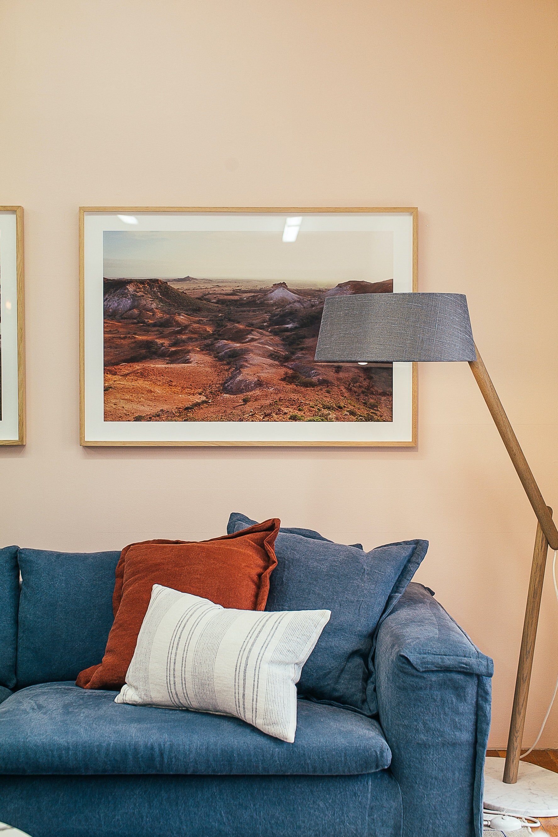
You can also look at an existing object in your home, such as an inherited piece of furniture, a gifted throw pillow or a beloved painting. Look for something with sentimental value or emotional connection and pull the colors from that object.

Creating the Right Feeling
Call it a “mood,” a “vibe,” an “ambiance,” or whatever you like, but the way a space feels is important. And interior paint is the first step to creating the right feeling inside your home. You don’t have to have every single object and piece of furniture mapped out before you begin painting, but you do need to consider what kind of atmosphere you want to create in each space.
For bedrooms, you’ll definitely want to create a calm, relaxing environment. But how you want to feel in the other rooms should be mapped out. What do you want to feel in each room? What should your family feel in each room? What about your guests? Defining your desired feelings first is key to choosing the right paint colors.
As for what colors help create your desired atmosphere, stay tuned; we’ll delve into color psychology soon.
Looking at Paint Chips
You can also gain some inspiration by checking out paint chips at the hardware or paint store. This can be a little overwhelming, but when you’re surrounded by thousands of paint chips, remember that there are only seven colors in the ROYGBIV spectrum (ROYGBIV = red, orange, yellow, green, blue, indigo, violet).

When browsing color samples, look at the darkest color on the strip, not the lightest. The lightest will start to all look the same, so you’ll want to focus on the bottom color. Chances are, if you like the darkest color, you’ll like the lightest one as well.
Factor in Color Psychology
Like we mentioned, colors evoke an emotional response, and color psychology is a frequently discussed topic. Although you might be able to find conflicting opinions, in general, “cool” colors (the GBIV part of the color spectrum and whites) are seen as restful and soothing. On the other hand, “warm” colors (you guessed it, the ROY part of the color spectrum) are perceived as energizing and dramatic.
Again, it depends on what mood you want to establish in each room, but often cool colors can be used to help create calm in private rooms like bedrooms or bathrooms, while warm colors help bring life to social spaces like family rooms, kitchens or playrooms.
If you do some quick searching on color psychology, you’re likely to find a myriad of sources making claims like “yellow stimulates the brain” and “red makes you hungry.” And while these claims are certainly rooted in research, at the end of the day it depends on you and your family. One person’s purple paint might make them happy but make another person want to scream.
Color psychology is definitely worth considering, however, especially if you’re stuck between specific colors or when determining children’s spaces.
Use Color to Highlight Architectural Elements
Setting the mood and creating an ambience is the only thing color can do. Color can hide or highlight architectural elements and help alter perceptions as you like them. Here are a few ways interior paint can make a difference on architectural views.
Making a Room Cozier
If you have a large room or even just want to make a small space feel cozier, interior paint can help you accomplish this easily. The right color can help you create a welcoming atmosphere in a foyer or an intimate feeling in a study or library. If you’re looking to make a room cozy, focus on dark colors. Dark colors give the impression that walls are closer than they actually are, “hugging” its inhabitants.
Making a Room Feel Bigger
On the other hand, cozy isn’t always the goal. Lighter colors can open up a small space and make it seem bigger. Look for crisp whites or light hues to open spaces and make them feel bigger.

Creating Flow in Open Plans
Open floor plans are great for providing light and plenty of space, but separate zones are still necessary. If you have an open floor plan, interior paint color can be very important to help create zones. You may want to clearly delineate the kitchen from the dining room or the dining area from the living room, for example. Many are inclined to stick to a single color for the entire room, but that would be a mistake.
The key to paint in an open floor plan isn’t a single color or even a single color palette. Experts recommend choosing muted, dustier values that flow well into each other. Look for colors that have been softened by gray, such as historical palettes, for an easy flow.
Emphasizing Details

You can also use paint to emphasize details in your home, such as molding, doorways or ceiling medallions. For a subtle emphasis, paint molding or doorways just one or two shades lighter — or darker — than your walls.
If you want to go with a less subtle approach, paint a metallic glaze over top of the detail, like copper or bronze. This translucent shimmer will enhance the feature you want to emphasize and draw attention.
Creating Contrast
If a room in your house contains wainscot, this presents a great opportunity for you to use paint to create a contrast. A dark wainscot below a bright wall brings attention to the upper walls, while a bright white wainscot next to a colored wall draws the eye to the wainscot.
If you don’t have a wainscot, you can still create contrast and the effect of a wainscot. Simply paint the bottom third of the wall in one color and the upper walls in another, then install a piece of flat molding along the intersection. Paint the molding the same color as the lower wall, and you’ll get the same effect as wainscoting.
Adding a Focal Point
If you don’t have any architectural elements to highlight, consider painting an accent wall to add a focal point to the room. Paint the accent wall in a vivid hue and keep the other walls a soft color such as white or neutral beige.
You can go as dramatic or as subtle as you want with an accent wall. If you don’t want to paint a wall something bright, consider painting an accent wall a few shades darker than the primary walls to give it a small punch but nothing quite as extreme.
Creating a Fifth Wall
No, we don’t mean you should build a pentagonal-shaped room. But you are surrounded by another area you may want to paint as well: the ceiling.

If your ceilings are low, you can create the illusion of height by painting them white. Ceiling white typically makes a room feel more airy and light.
You could also paint the ceiling a lighter shade than the wall colors to create the same effect. This option softens the contrast between the wall and the ceiling, making the room appear bigger.
Alternately, you can also use the ceiling to create a cozier space by painting it a darker hue. If you have high ceilings, you should consider this tactic, especially in areas that you want to create a warm, intimate feeling. Either way, put some thought into your ceiling color.
Avoid Common Mistakes
When you’re choosing interior paint colors for your home, take care to avoid some common mistakes that people often make.
1. Being scared to explore different options
Far too often homeowners choose eggshell or a light grey for their walls because “it goes with everything,” and they’re honestly just too afraid to commit to a bolder color. And while there’s a time and place for neutrals, make sure you aren’t choosing those just because they’re convenient.
You can always get samples and test them on your walls. If the colors are too strong, ask your paint store to lighten it or tone it down. Be bold.

2. Loading the walls with too much paint
Although you should be bold, you also want balance. Think about what elements will be in your room and create a color balance. If you have a bold piece of furniture, curtains or rug, you might want that to be the focal point in the room instead of the walls.
Too many bold colors compete for attention, so be intentional about what hues you’re bringing into each space.
3. Rushing through the process

Choosing an interior paint color shouldn’t be a spur-of-the-moment decision. Think through the factors listed above, then test it on your walls. Some experts recommend painting a large piece of board with your tester and moving it around the room for a few days to evaluate how it looks in different areas throughout the day. Lighting will completely affect how paint color is perceived throughout the day, and the amount of natural light available is a huge factor.
Take the extra time to test a color and actually live with it for a bit to see if you will enjoy it in the future.
4. Deciding against primer
No matter how dark your paint might be, there will be interference from the previous wall color. Even neutrals can alter the shade somewhat. Using a primer is vital to getting the actual color you chose for your walls and is a step in the painting process that just cannot be skipped.
5. Evaluating the correct finish
Even after you’ve chosen the color that works for you, you’ll also need to choose the correct finish. Fortunately, many paint stores are willing to provide advice based on the room’s function. Satin finish is often best for walls because it is scrubbable, while semi- and high-gloss finishes are good for trim or molding.
But don’t be afraid to go outside that norm as well, experimenting with what finishes work for your walls and how lighting and other elements affect how each finish portrays in your home.
At the end of the day, it’s your space and your home, and you want to create an atmosphere that speaks best to your needs and how you best feel. Be bold, go outside what is typical, and you are sure to find the right paint color that makes you feel at home in your home.